Overview
- Background: Cubby is a collaborative storage platform where users can store and share different types of content all in one place. Click here to view the live homepage and dashboard that I developed for Cubby!
- Duration: October 2018 - January 2018 (4 months)
- My Role: Research, Branding, User Experience, User Interface, Front End Development
- Tools:


Research & concept
Competitive analysis
The cloud-based storage application market is dominated by large incumbent players such as  ,
,  , and
, and  . In such a market where the concept and features are pretty standard, I knew it was important for Cubby to present a targeted design for a specific audience.
User research
I conducted a survey in order to better understand potential Cubby users and how to best meet their needs.
100%
use multiple devices to access and save digital content
~80%
use social media when signing up for accounts on other sites
18-34
represents the
average age of survey respondents
Based on these findings, Cubby needed to incorporate the following:
- Responsive design for viewing across multiple screen sizes
- Social sign-on capabilities
- A fun, fresh take in terms of branding and visual design
User stories, flows, & site map
Based on the refined concept, I created user stories, user flows, and a site map to use as a foundation for my design.
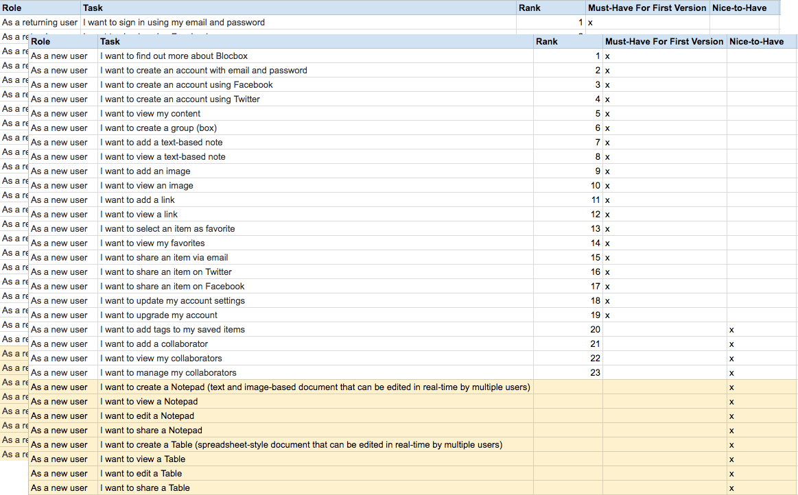
User stories
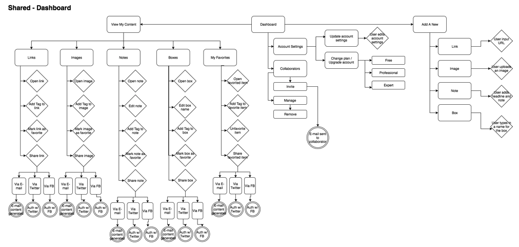
Sample user flow (dashboard)
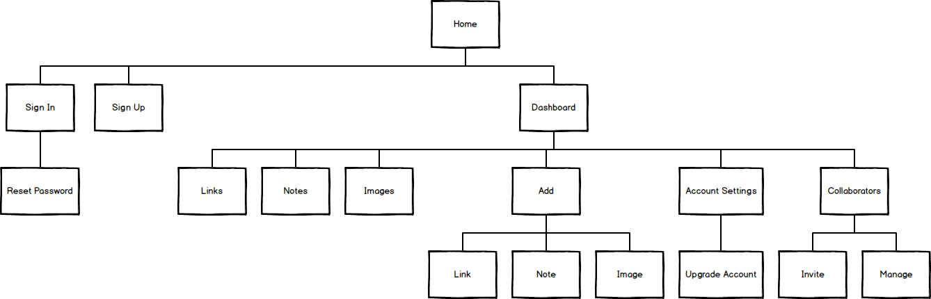
Initial site map
Initial design
Wireframes
Using myBalsamiq and Illustrator, I created wireframes for the Cubby homepage and dashboard
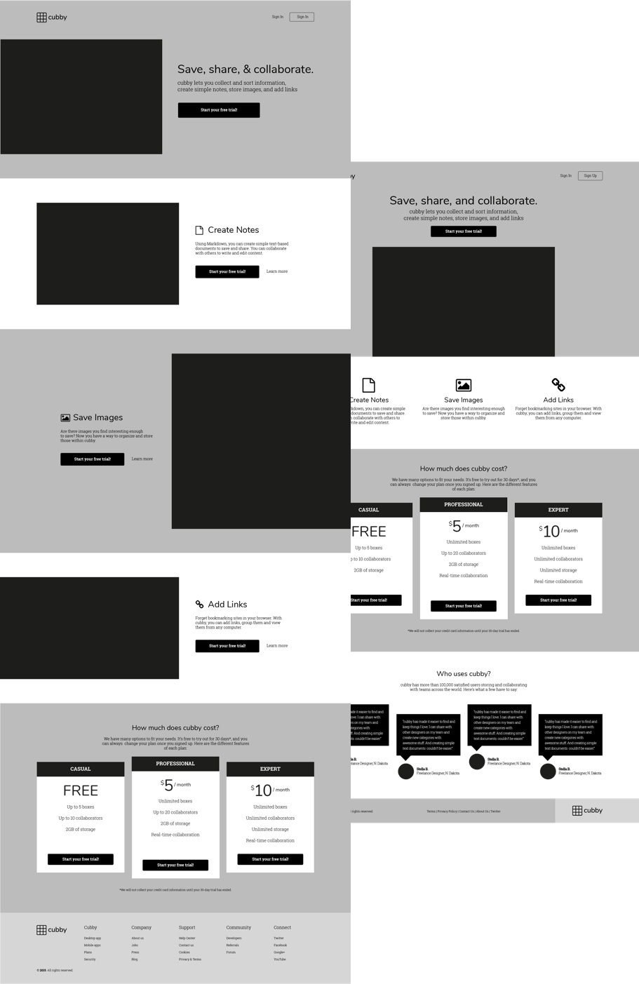
Homepage wireframe options
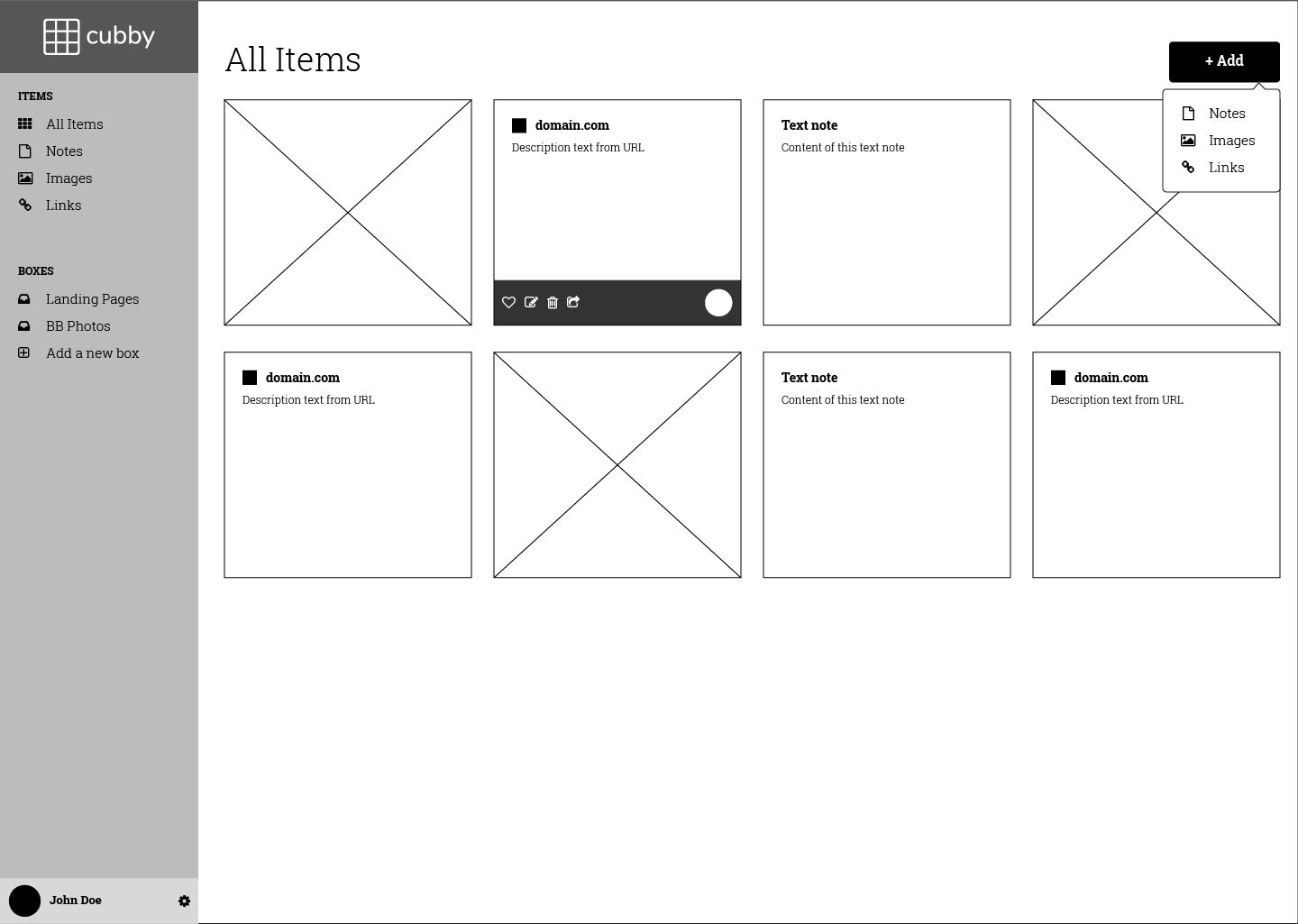
Dashboard wireframe
Testing and Iteration
I created a prototype in InVision using the high-fidelity wireframes I mocked up in Illustrator. I used UserTesting to test my prototype, as well as conducting in-person usability tests on three potential users. Two important pieces of feedback that I incorporated into the final design were:
- Moving the account settings button to the top right to make it easier and more intuitive for users to find
- Moving the add button to the left to make it more prominent and the first thing the user sees as they read from left to right
I also used Usability Hub to create a preference test for the placement of the Add button on the dashboard. However, as the results were inconclusive, I decided to stick to my original design in Option 2.
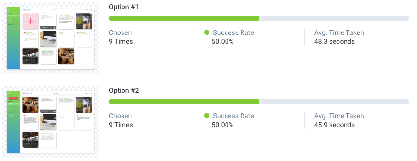
Preference test results
Final design
Homepage
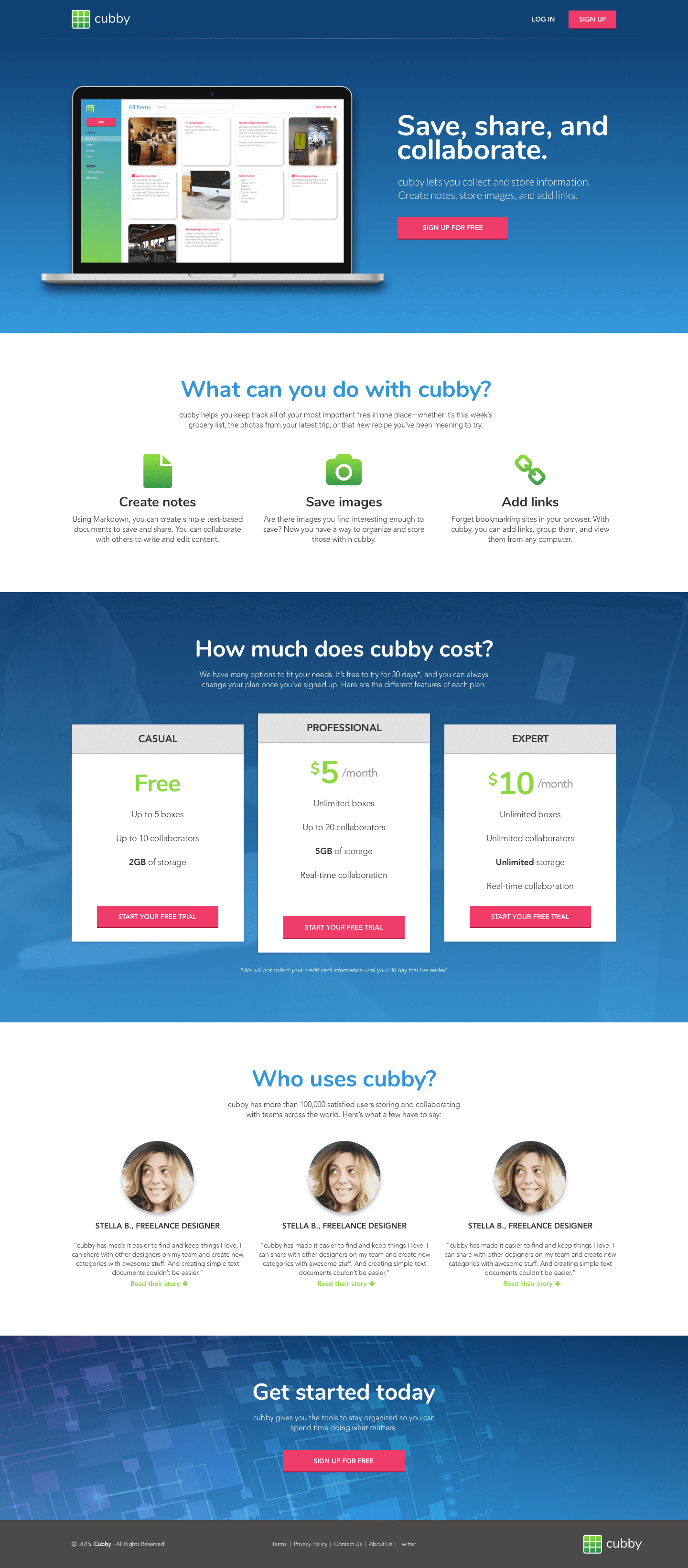
Final homepage design
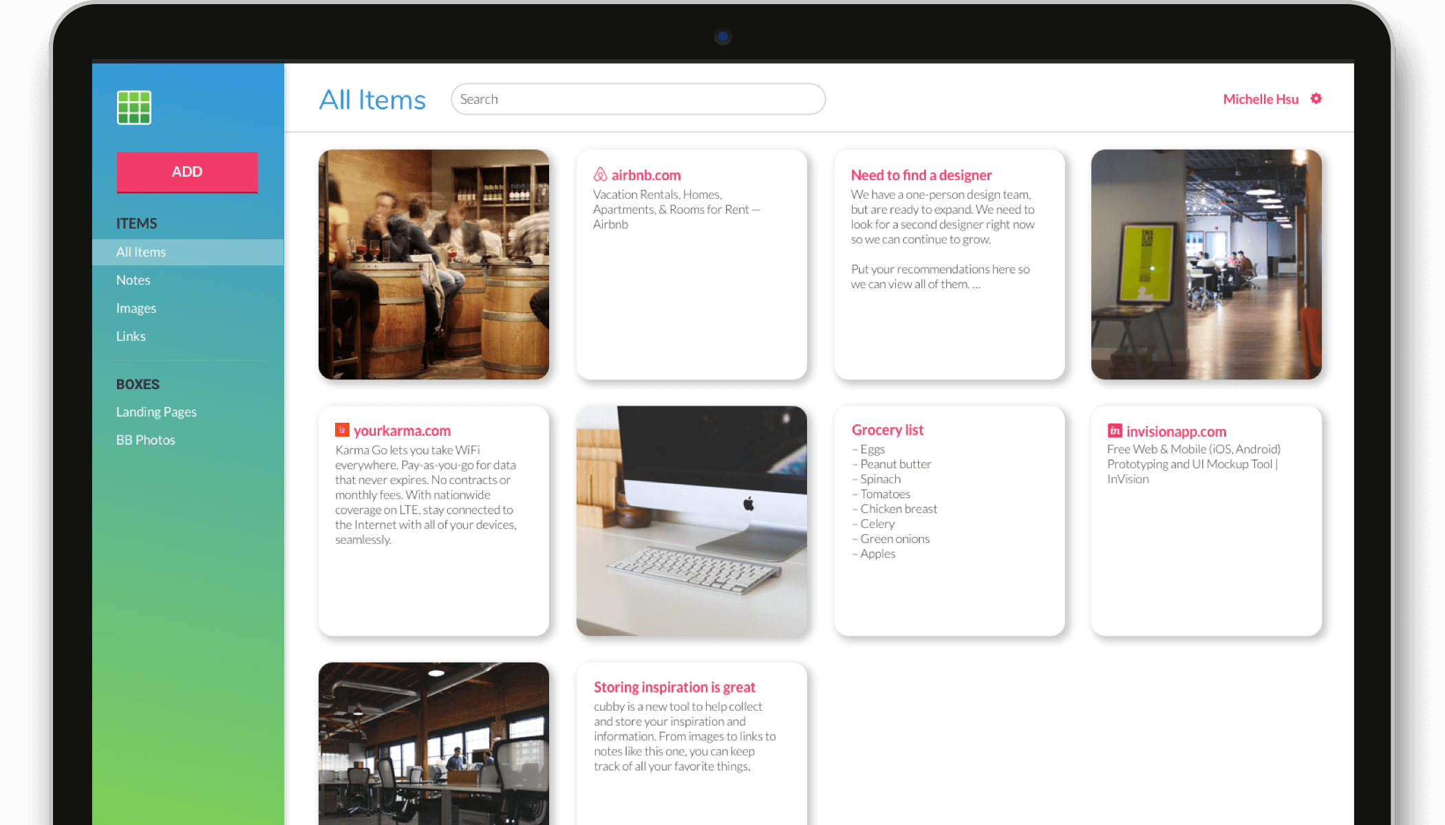
Dashboard and Account Settings
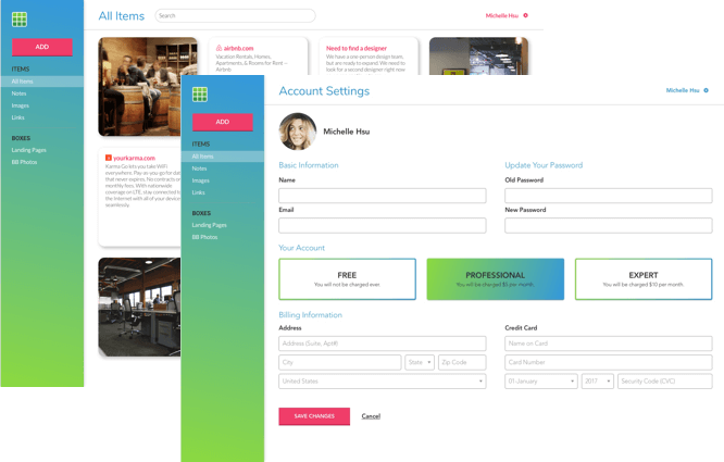
Final dashboard design
Content Detail
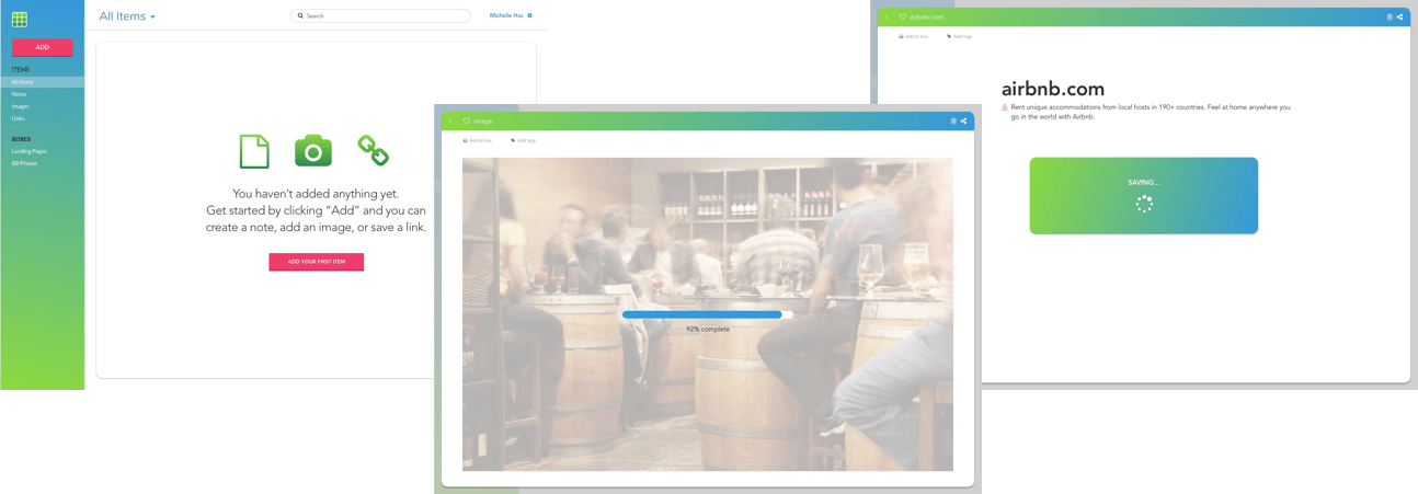
Final content detail designs
Development
In the development phase, I focused on building a responsive site using mobile-first principles. I included a hamburger icon and sliding left navigation for mobile and tablet devices through the use of media queries. For the interactive drop-down menus, I used a jQuery plugin (Dropit). Click here to view the live homepage and dashboard that I developed for Cubby!
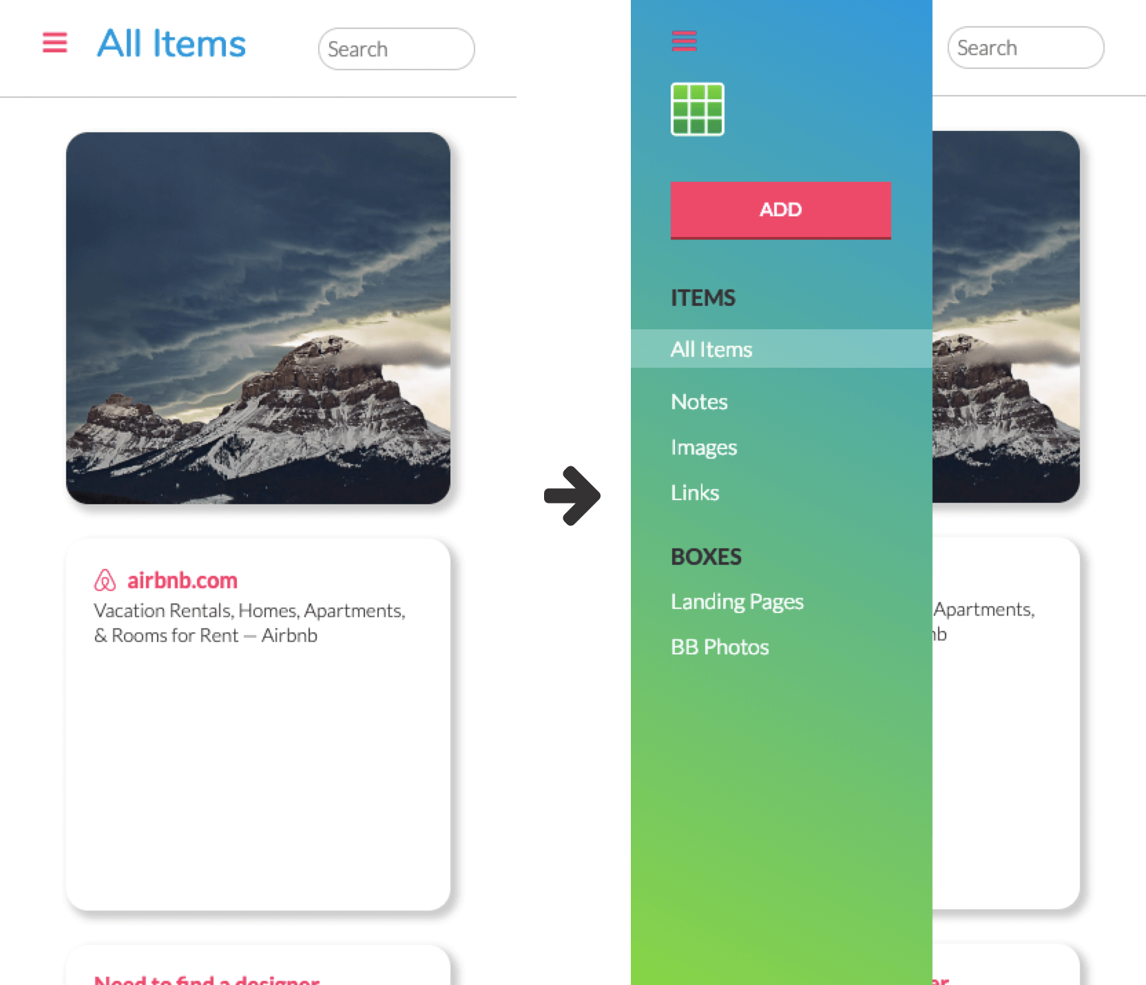
Responsive sliding navigation bar on mobile
Conclusion
Throughout this project, I really enjoyed learning and executing each step of the design process. It's amazing how much work goes in from start to finish and how much iteration the product goes through throughout the process.
The biggest takeaway for me from this project was during the color scheme and typography selection process—learning to keep in mind that I am designing for a user base, not myself, and that it doesn’t always matter what my personal preferences are.